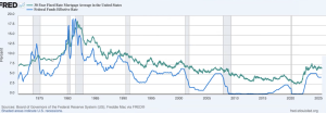

The first graph is a 60 year history of the correlation between the Fed funds rate and the 30 year mortgage. You can see they move fairly similarly, but not necessarily in lock step. The second graph shows the the negative correlation that has been happening over the last 10 months. It’s an interesting phenomenon and will remedy itself here shortly. Our hope/expectation is for mortgage rates to go down and not the Fed to raise rates.
Higher interest rates affect more than just home loans. The purchasing of expensive products expected to last longer than a year (Durable Goods) has dropped consistently over the last few months, but those losses have moderated from -9.3% in July to -2.8% this month.
Case Shiller reports that Home values are up 0.1% from this time last month and 2.1% from this time last year, while the FHFA show shows values are down 0.2% month over a month but up 2.6% from 12 months ago. Where FHFA in calculates data only for property acquisitions involving a conventional mortgage, we see that cash buyers are getting a 0.5% discount on their negotiated sales price. However, if you compare the leveraging of cash on cash, those who utilize financing have exponentially higher returns on their investment.
On the technical side of the charts, we see a pendant formation approaching a tip, which usually means we should be expecting a break out to one side or the other. MBS prices have been out of ceiling now for over a month and have yet to break through. It will take some solid negative data to punch above the threshold, leading me to believe that rates might break to the upside in the next few days. So with mortgage rates being as good as they’ve been all year, it’s a good time to lock.